8/30/2018
- CSS intro review
- Background & Borders
- Margins & Padding
- Height & Width
- Display
- Floats
- Flexbox
How do we add CSS to HTML?
There are 3 primary ways.
- Putting CSS in an element's style attribute.
- Putting CSS in a style tag in our HTML
- Putting CSS in a .css file and referencing it in HTML.
The third method is the most desired approach.
CSS Selectors
CSS selectors vary in size length and complexity, but they are primarily based off of 3 core selector methods.
Tag Selector
Class Selector
ID Selector
That's a lot to remember
Use a CSS cheat sheet to reference what values are available to specific properties.
Backgrounds
Changes the background appearance of the element.
- background-color
- background-image
-
background-repeat repeats the background image.
repeat-xrepeats the image across the x axisrepeat-yrepeats the image across the y axisno-repeatmakes the image only appear once
Backgrounds Continued
-
background-position Accepts two values. First the x and then the y. You specify these by using
these values.
- left|right|center top|center|bottom
- 10px 20px; - This would be 10px off the left and 1px off the top
- x% y%
Examples
.item{
    background-color: #ff0000;
    background-color: blue;

    background-image: url(http://via.placeholder.com/350x150);
    background-image: url(../images/me.jpg);

    background-repeat: repeat-x;
    background-repeat: no-repeat;

    background-position: center center;
    background-position: 10px 10px;

}
Borders
This CSS property defines the borders around an element.
- border-width accepts pixel value
-
border-style
solidthe most commondasheddotted- Many others
- color accepts any valid color
Examples
    .fig1{
        border-color: red;
        border-style: solid;
        border-width:5px;
    }
    .fig2{
        border-color: navy;
        border-style: dotted;
        border-width:10px;
    }
That's a lot of code. Can we shorten it?
    .fig3 {
        border: 5px solid red;
    }
    .fig4 {
        border:10px dotted navy;
    }
Modify a specific border
    .fig6 {
        border-left: 5px solid red;
    }
    .fig7 {
        border: 10px dotted navy;
        border-right-style:solid;
        border-right-width:5px;
    }
More specificity
    .fig8 {
        border: 5px solid red;
        border-bottom:none;
    }
    .fig9 {
        border-bottom:none;
        border: 10px dotted navy;
    }
More Info
Margins
CSS Margins add spacing around an element.
- margin-top
- margin-right
- margin-bottom
- margin-left
Padding
CSS Padding add spacing inside an element.
- padding-top
- padding-right
- padding-bottom
- padding-left
Shorthand
5pxapplies 5 pixels to all 4 sides.5px 10pxapplies 5px to top and bottom and applies 10px to left and right.5px 10px 15px 20px- 5px to top
- 10px to right
- 15px to bottom
- 20px to left
Margin Shorthand
.fig10 {
    /* Applies 5px to all 4 sides */
    margin: 5px;
}
.fig11 {
    /* Applies 5px to all 4 sides */
    margin: 5px 5px 5px 5px;
}
.fig12{
    /*Applies 10px to top and bottom
      and 30px left and right*/
    margin:10px 30px;
}
Padding Shorthand
.fig13 {
    margin: 5px;
    padding:15px;
}
.fig14 {
   margin:10px 30px;
   padding:30px 10px;
}
Center Align Block Content
See the Pen UA-ITR-Margin Auto by Jon (@Middaugh) on CodePen.
Do The Math
W3 Schools sizing calculationsW3 Schools sizing tutorial
Height & Width
Sets the specific height and width of a block element
-
height
- min-height
- max-height
-
width
- min-width
- max-width
Examples
.fig15{
    height:100px;
    width:250px;
}
/*Applying this to a span tag*/
.fig16{
    height:100px;
    width:100px;
}
.fig17{
    max-width:100px;
}
Display
The CSS display property is used to change the default rendering style of an element.
- inline - span, em, strong
- block - div, p, h1-h6
- none - hides the element
- inline-block - Renders block, but stays in a single line.
- Acts like inline but can have a set width and height.
You can change any element to display any type.
	how now
	brown cow
Will the text all be on one line?
	how now
	brown cow
Will the text all be on one line?
	how now
	brown cow
Will the text all be on one line?
Yes, but the spacing has to be tweaked. Inline block acts like an inline element but can have a set width.
Example
See the Pen UA-ITR-CSS-Dispaly by Jon (@Middaugh) on CodePen.
Float
Float changes the position of an element and provides advanced layout to websites.
- left
- right
- none
Example
See the Pen UA-ITR-CSS-Floats Example by Jon (@Middaugh) on CodePen.
Clear
Clear resets floats and allows content to continue down the page.
- left
- right
- both
Example
See the Pen UA-ITR-CSS-Floats by Jon (@Middaugh) on CodePen.
Why is the footer floating when it doesn't have float styling?
All About Floats
CSS Flexbox
Flexbox provides a more predictive page layout for responsive screens. It doesn't use floats and adjusts to the available space better than traditional floats. Flexbox aims to fill all available space without overflowing its container.
It has gained a lot of popularity over the years. It doesn't support older versions of IE.
Flex Container
The flex container is the element that is wrapping all of the items you want to align.
Implementing
To implement Flexbox, we need to apply a property to a container.
    .container{
        display:flex;
    }
Code
See the Pen UA-Flex-Flex by Jon (@Middaugh) on CodePen.
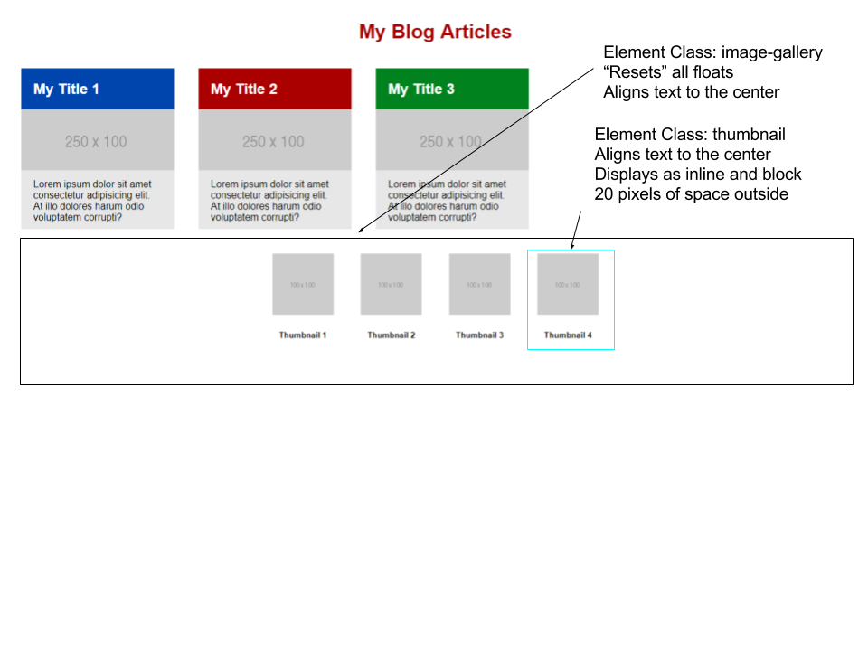
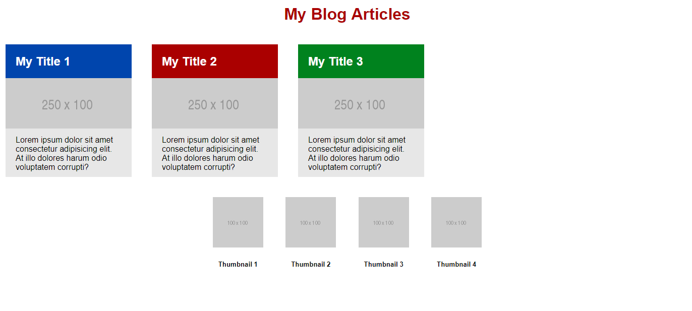
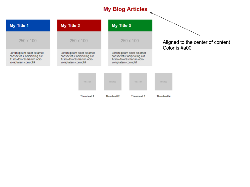
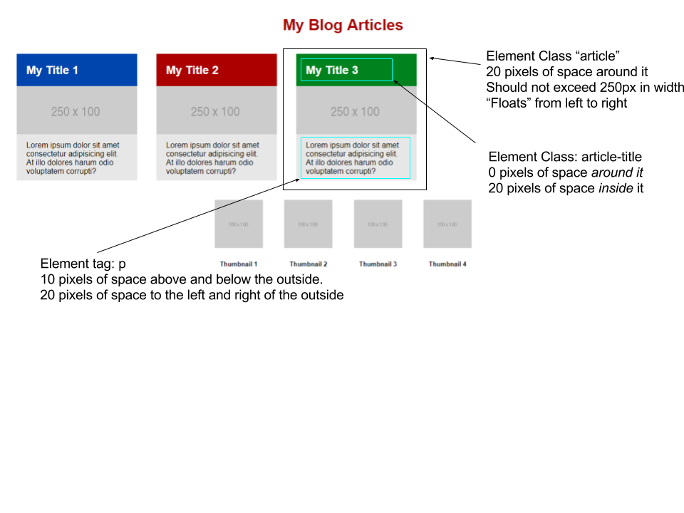
Exercise
Fork this Pen and make it look like this.
You should not need to modify any html if you use float...not sure about flexbox
Part 1
Part 2
Blue:#0045ad Red: #a00 Green: #00821e
Part 3